
When investing in the share market, how do you know what a company’s value is? Since March 2020 we have seen the value of almost all listed companies move through an incredible range, some having cataclysmic falls and some setting new record highs. Most have moved low to high over 100% in the last 12 months and some, such as GameStop, even more. GameStop, a listed company in the US, has ranged from $2.57 to $483 a share (18,693%) in 12 months.
Apple, the largest company in the US, moved in a 173% range from $53 to $145 a share and in New Zealand, a stable utilities company like Meridian Energy, has moved from $3.61 to $9.94 a share (175%), only then to fall back to below $6.
These significant changes in a company’s share price change the overall value of the company because a company’s “market capitalisation” is calculated as the number of shares on issue multiplied by the share price. So when the share price changes in such large extremes, does this actually mean the company is worth that much more (or less)?
Probably not as ultimately you couldn’t buy the whole company at those prices, which is why takeovers are usually at a premium to the market value. However this volatility and uncertainty can confuse many investors and scares off others. In this article, we’re going to explore how different investors value companies. We’ll use recent examples of Auckland Airport, Meridian and A2 Milk, all NZ 20 companies and also the spectacular case of Gamestop, as mentioned above.
Being a shareholder
At its essence, an investor owns a (small) percentage of a company and is therefore entitled to a percentage of its profits. A company’s board decides how much of that profit is retained for growth and how much to distribute as a dividend.
Because a company’s profitability is not guaranteed and paying dividends is optional, these “risks” mean, the “total shareholder return” investors want from buying shares is higher. One simplistic measure of calculating this is the price-earnings (P/E) ratio.
The P/E ratio is calculated as the market capitalisation divided by the last published earnings of the company. Or identically by dividing both side by the number of shares, the current share price divided by the earnings per share. Meanwhile, the forward P/E ratio is an analyst’s estimate, based on a company’s guidance, of the future earnings per share divided by the current price per share.
For example, if the share price is $20 and the earnings per share is $1, the P/E ratio is 20. If you inverse this number (1/20) you get the expected rate of return (i.e. 5%) as for every $20 you invest, you “expect” $1 of return in earnings be it paid as a dividend or retained for growth. Earnings are not the same as profit, but that’s another topic/nuance. Some investors use this P/E ratio to be able to compare to other companies or investments, or to assess whether they think a company’s share price looks expensive or is a good buy.
The long term historic average P/E for mature, listed companies is 20. Many textbooks and experts say that any higher than that is too expensive for the risk taken. Is this outdated?
The trouble with P/E ratios
Simply using the P/E ratio ignores two major influences on share prices. First, the alternative options available. If interest rates are high, the certainty of term deposits and high-quality bonds mean that they are considered lower “risk” choices with a reasonable return. If you are getting a 5% return on a term deposit, you would surely want a P/E ratio of less than 20 for the added uncertainty you are taking.
It’s also a reason why a rise in interest rates (or even just fear of a rise) can cause a fall in share prices, as buyers are wanting a higher rate of return compared to the certainty of another investment.
Second, is that most companies expect themselves to grow, and some companies experience huge annual growth. By comparison, other companies in the past year have had a significantly below average or unprofitable year, which is unlikely to be permanent. This can result in strange anomalies like Auckland Airport.
Based on the 2020 published earnings, as at April 2021, Auckland Airport has a P/E of 142 or 0.70% return. Yet if you compare to their 2019 earnings, the P/E is 32 which is about a 3% rate of return. This also seems high. However, Auckland Airport had a 5-year compound annual growth rate (CAGR) of 22% to 2019. If you drew out that 5-year CAGR into the future (very dangerous), the P/E comes down to 12.7, about a 7.9% rate of return. Should that happen you would also expect some significant capital gains. The flipside to that is how many years into the future could an airport grow profitability at 22% per year?
The trouble with numbers
These calculations are the basis of fundamental analysis: using the company’s published data to estimate their valuation. This analysis is so an investor can calculate what a share is worth now and estimate what they may be worth in the future. More sophisticated investors and analysts go much, much deeper.
Discounted Cashflow Analysis
A common tool analysts use is discounted cashflow analysis (DCF). Using DCF, analysts investigate a company’s many inputs and activities to build a model estimating how much free cash flow (FCF) they’ll have in the years ahead. After adjusting the inputs for news and current events, the free cashflow is “discounted” to account for future inflation and interest costs, dividing it by a “cost of capital” percentage for a number of years. The simple idea is that $1 today is worth more than $1 at various points in the future, because of inflation, opportunity cost and borrowing cost of waiting for that $1.
With analysis, comes challenges
There are two major challenges with traditional DCF, as powerful and complicated as it can get.
First, the cost of capital makes a huge difference to the end valuation. If interest rates fall, then the valuation automatically rises. Which is one factor as to why share prices have performed so well over the last few years.
Second, most DCF models include a long-term growth rate assumption. This growth rate assumes the company exists forever and grows forever(!), leading to a number which can account for the majority of the end valuation. Consequently, if you change the growth rate by just 1%, there is a huge change in the value of the company.
These assumptions make a huge difference and create a variety of outcomes, not least of which is that – the future while unknown will certainly not be linear, nor as expected.
An example of this is A2 Milk. During COVID their share price surged as milk exports were expected to increase and the company continued to deliver positive news, as they had done for several years prior. However, cracks appeared in the opaque reseller channels used to get their product to its major overseas markets. Suddenly, the analysts and their models didn’t believe the company was going to continue to grow at its extraordinary rate, with changes to the growth forecasts significantly reducing the current value of the company
Shares bought and sold for over $21 in August last year, are trading today for less than $9. That is the challenge of a growth company valuation. A recalculation of the growth potential and associated growth rates can crash the price of what is still a quality company.
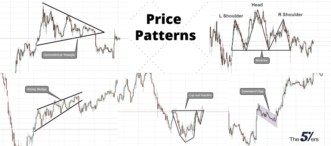
Technical Analysis: reading graphs to predict the future
Another more short-term way of valuing a company is known as technical analysis. The name sounds inviting but the reality of this analysis is that it’s just using past graphs of share price movements to estimate the direction of the future share price. Otherwise known as charting, technical analysis looks at a company’s share price chart then overlays a series of lines and shapes in order to find potential patterns, many of these shapes have now developed their own crazy names.
Favoured by day traders and other speculators, research has shown that 90% lose money trading on such short-term basis.
Some would argue that this analysis is no more than blind gambling using pseudo theories about the intention of the “market”, meaning the collective action of other buyers and sellers. There is of course some truth to “momentum”, as sentiment and positive news about a company can mean that demand for the company’s shares rises, and buyers are willing to pay more. However, always remember there also needs to be a seller willing to sell. At some point that sentiment changes and the opposite happens which is never predictable.
Additionally, while there are observable ceilings and floors (resistance and support levels for share prices), these are explainable by limit buy and sell orders by larger investors. They’re either seen as depth in exchange “order books” or held in private by a broker/large investor, who feels the company is undervalued or overvalued at a particular price.
Finally, reading charts is making an assumption that a majority of investors are acting in the same way to buy and sell, which is laughable to be honest, and relative strength calculations, assumes that all that can be seen is all there is to know and there are no undisclosed/private intentions.
Let’s take Meridian for example
A good example of this is Meridian, where the share price was pushed up from $6.51 on 21 December 2020 to almost $10 on 7 January 2021. All thanks to light share trading volumes in the New Zealand holiday season and increased international interest in Clean Energy companies.
This price increase occurred on a total trading volume of less than 2% of the company’s available shares in the two weeks after Christmas, i.e. the company increased in value by over 50% on just 1% of the shareholding in the company changing hands.* Those who held Meridian shares and were holidaying are probably kicking themselves they didn’t sell at almost $10 as the share price is back below $6 in April 2021!
Why the increase? In short, the lack of liquidity pushed the price up. Below is the table of the volume traded on those days compared to average daily volume (ADV) over period either side. There was an surge in attractiveness and momentum pushed higher until profit taking kicked in and the price fell back towards a “fair valuation”. These are always easy to see in hindsight, but in the midst it is difficult to tell if you are at the top, the bottom or in the middle, and beware the lure of market timing.
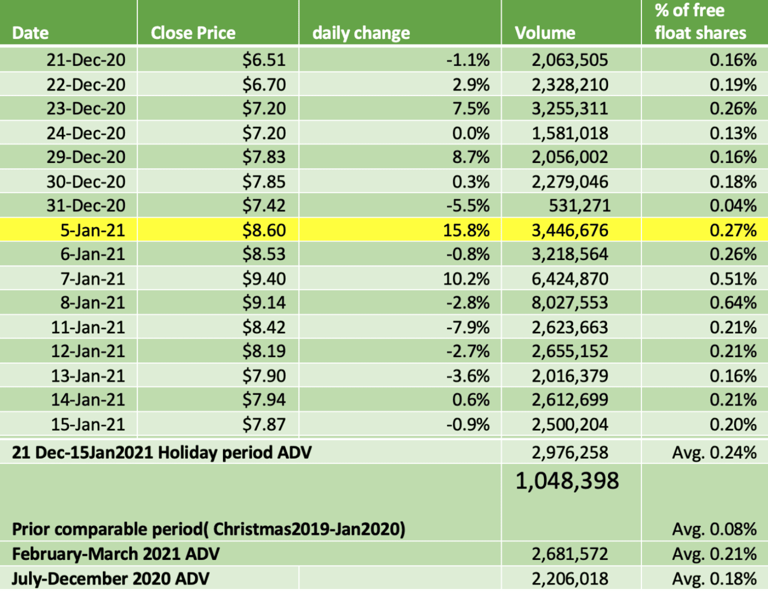
*The NZ Government owns half of Meridian and this is considered unavailable.
What about the great David vs Goliath debate?
Much has been written online about GameStop’s wild ride this year. In case you missed it, some motivated Reddit forum followers decided to make the life of a hedge fund difficult. That hedge fund was “shorting” the company, aiming to benefit from its demise. The followers drew huge social media attention and caused a “short squeeze” for the hedge fund having to reduce their liability by buying at increasingly crazy prices. The GameStop story has been referred to as David vs Goliath, but the reality is that it’s not the case. More on why not, here.
What this story has illustrated is that news sentiment be it Reddit memes, Elon Musk tweets or ‘Be like Buffett’ Facebook groups can massively distort the valuation of a company in the short term (apparently by about 18,693%) if there is a belief or greed that “someone else” will or must buy off you at a higher price in the future. This is also known as the Greater Fool Theory or a Keynesian Beauty Contest.
To really reiterate the point and for a bit of a laugh, let’s take a look at an example…
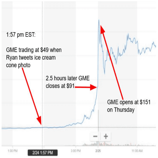
On Tuesday 23 February 2021, GameStop stock (GME) closed the day at $44.97 per share.
On Wednesday 24 February at 1:57 PM EST, Ryan Cohen, the 33year old 10% major shareholder posted a photo of a McDonald’s ice cream cone and a frog emoji to Twitter. Seriously:

What does that have to do with anything? Well… apparently a lot! For those chartists out there there’s a term called “Moving Average Convergence Divergence”. Also known by its abbreviation “MACD”, some view it as a “trend-following momentum indicator that signals when a stock might be overbought or undersold”. So it’s an indicator that it might be time to buy or sell a stock. MACD. Like McDonald’s… Hence the ice cream cone in Cohen’s tweet.
What about the frog? Apparently when a stock is about to cross from being oversold (aka it’s time to buy), the software chart colours go from purple to green, so people call it “going froggy”.
When Ryan sent his tweet at 1:57 PM EST GME was at $49. Two and a half hours later when markets closed, GME was at $91.
GME opened at $151 on Thursday.
GME ended the week at $101. At one point, that took Ryan’s share value from an already staggering $441m, to mere hours after the tweet valued at $1.08b. He’s now worth about $2 billion, but would be unable to find enough buyers to sell all of it to actually be a billionaire now, even if he wanted to.
So there you go – welcome to the world of meme stonks. It’s time to head to McDonalds.
There’s more to valuing a company than its share price
An unfortunate by-product of accounting practices is that a company’s value is based on the last sale price of the last share traded, even if you have no intention to buy or sell at that price, or could find a buyer or seller at that price. What’s important here is that different investors use varying techniques to work out whether they’d like to buy or sell at a given price (and we’ve only covered two of many in this blog!), but the reality is that there is much more to the value of a company than its share price.
As an investor of thousands, not millions, you can gamble the distortions that do occur but require prophetic timing. Alternately you can broadly trust that there is fair value most of the time and that markets are more efficient than inefficient at discovering equilibrium. The most important thing to remember when investing is to ensure you are thinking long-term (think years not weeks!) and that your investments are diversified.
