
A buffet(t) of historical performance
Buffett’s following is the stuff of legend and for good reason. However, the magnitude of Berkshire’...

Catherine Emerson
3 January 2020

Recently we’ve been having conversations with people on the importance of looking beyond the headline performance results. What’s known as performance trickery is often rife in an industry where some can benefit from confusing the everyday investor. For active managers, advertising what seems like very strong performance is their bread and butter. But how good is their value-add (alpha) actually?
We have limited the review to actively managed New Zealand equity funds, of which there are approximately 15. The data we have used on all these funds has been sourced from the Disclose Register, where returns (often weekly) are published net of fees, gross of tax.
Side note: it is a licensing requirement for all fund managers to publish this data on Disclose, including ourselves. Designed by the FMA for transparency, unfortunately many individual investors are unaware of this fact.
Where possible, we have used Fund Update data (available since 2016, as Fund Updates were not legally required prior to this). We note that in a handful of cases there was a discrepancy for some Funds in the return figures between the Fund Update data and the Disclose Register data. When there was a discrepancy, the better performance figures were used, and it was never more than 0.5%. No fund was included with less than 5 years data.
While there are a number of trans-Tasman funds in the market, data is not readily available to accurately determine the appropriate trans-Tasman index weightings across time. This means we are unable to monitor the shift in weightings in each fund between Australian and New Zealand assets.
Benchmarking a trans-Tasman fund solely against an NZ 20 Index is not a fair reflection of the portfolio, especially given the strong performance of the NZ market compared to the Australian counterpart. In future, we may compare each fund against its benchmark asset allocation as initial indications are that results are no different.
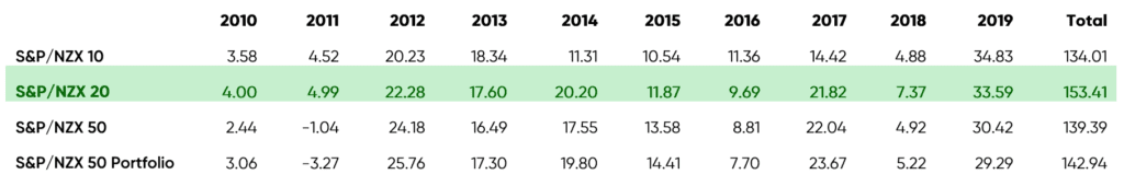
The S&P/NZX 20 Index used in the benchmark has been live since April 2012, with Index returns data available from January 2007. To give you an idea of how the New Zealand market performance in the past 10 years, the annual total return data is as follows:
The active managers performance data was analysed on a calendar year returns basis, calculating both cumulative value add and annual value add (also known as cumulative alpha and annual alpha).
We have not individually named the Funds or called our poor performers, this summary is to highlight the trend and challenge with active management. And how headline performance numbers can lead an investor to the wrong assumptions.
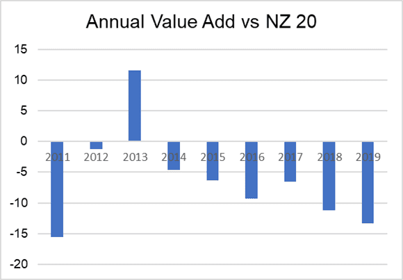
Somewhat of a surprise was the variation in returns between funds. Figure 1 shows the annual alpha of actively managed NZ equity funds with at least seven years of returns data. There is a wide variance in returns during any calendar year. However, there is a more consistent trend of correlated underperformance over the past 3 years.
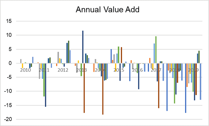
Figure 1: Annual Alpha vs S&P/NZX 20 Index
The average annual alpha of all funds researched was -2.52%.
Only two funds had positive average annual alpha during this period, both of less than 0.69%.
The range of average alpha per fund was between 0.69% to -9.26%.
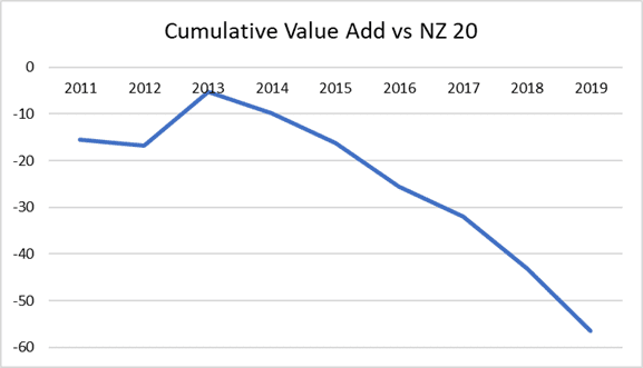
Of the two funds with positive average annual alpha, only one had positive cumulative value add since 2010. The fund with an average annual alpha of 0.69% had in fact delivered -26.22% cumulative alpha to the end of 2019. The average cumulative alpha for all funds, as at 2019, was -18.86%.
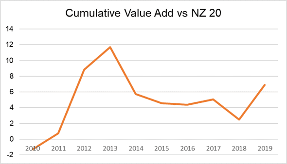
Two funds provided positive cumulative value add since 2010, with total cumulative value over that period of 4.21% and 6.90%.
The ‘best’ active fund delivered positive cumulative alpha of 6.9% over this period. What’s important to note, is that the majority of that value add came early in the fund’s life cycle, in particular, driven by great results in 2012.
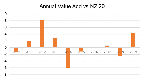
So if you were invested in the Fund from 2010-2012, you’d be chuffed. However, any investor who joined this fund after 2012 would have had a vastly different outcome.
The ‘worst’ active fund, so that with the largest negative cumulative alpha, displayed the following characteristics. It lagged the benchmark in 8 of 9 years, often substantially. This was despite a great reputation and positive returns in most years.
The purpose of this short analysis is to highlight that strong headline performance figures can mask a very different investor experience. The majority of a positive contribution to a fund’s cumulative alpha tend to have been delivered early in the fund’s life.
It’s also often concentrated in just one or two years of exceptional performance. Thereby luring in new investors with great headline figures, who’s experiences end up vastly different.
This aligns with a concept called “capacity”. That when a Fund Manager is small it is easier to acquire some good positions, but that as inflows grow it becomes increasingly difficult to deploy capital without moving the market or having to buy the biggest issuers regardless of analysis.
What we’ve tried with this approach to researching performance is to provide a framework to efficiently assess the value add of an active strategy. Whether it prompts you to review your portfolio construction or any active managers you currently invest in, we hope you’ve found it useful.
Let’s not forget, it’s easy to be tempted to chase past performance headlines, with little regard to the underlying evidence.
A buffet(t) of historical performance
Buffett’s following is the stuff of legend and for good reason. However, the magnitude of Berkshire’...
Catherine Emerson
3 January 2020

Why Past Performance is No Indicator of Future Returns
We’ve all heard the disclaimer “past performance is no indicator of future returns” thrown around or...

Chi Nguyen
9 December 2021

Demystifying Index Fund Returns
Some investors perceive index funds to be lower risk and therefore provide lower returns. But is thi...

Dean Anderson
12 July 2021
For market updates and the latest news from Kernel, subscribe to our newsletter. Guaranteed goodness, straight to your inbox.
Indices provided by: S&P Dow Jones Indices